An Technology blog focusing on portable devices. I have a news Blog @ News . I have a Culture, Politic and Religion Blog @ Opinionand my domain is @ Armwood.Com. I have a Jazz Blog @ Jazz. I have a Human Rights Blog @ Law.
Thursday, November 22, 2018
The iPod click wheel was the pinnacle of purposed hardware design - The Verge

"In today’s digital age, it sometimes feels like hardware has taken a back seat to the software that drives our devices. Button of the Month is a monthly look at what some of those buttons and switches are like on devices old and new, and aims to appreciate how we interact with our devices on a physical, tactile level.
It’s almost impossible to talk about hardware controls without mentioning the iPod click wheel. I’ve been dancing around doing this one for a while since plenty has already been said about how Apple solved the problem of navigating and scrolling through lists of data on a small screen without a touch interface. It’s a UI paradigm that still lives on in a way; the Apple Watch’s Digital Crown is probably the most direct descendant of the click wheel on Apple’s current products, offering a similar purpose of navigating around long text lists on a small screen.
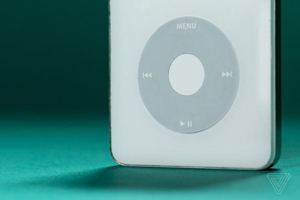
But I want to talk about something more specific about the iPod click wheel — in particular, the final iteration of the wheel that’s likely most familiar to people, the iconic gray circle with integrated buttons, introduced on the fourth-generation iPod.
That click wheel was the pinnacle of iPod design — so much so that for the rest of its non-touchscreen iPods, Apple didn’t mess with the design, even on its diminutive iPod nano. It was simple, it was uncluttered, and it was so easy to use that nearly anyone, regardless of their familiarity with technology, could figure it out.
But my favorite part of the click wheel is also the part that we’ve lost the most since we switched to touch-enabled devices: the ability to use it without looking at the screen.
It’s a small thing, but a significant one. Today’s devices demand our constant attention: they’re almost impossible to use without it, in fact. Look away from your phone, and you’re aimlessly tapping a featureless glass slab with no landmarks or guides to light the way. As Steve Jobs pointed out when Apple first launched the iPhone, a device without buttons can have an infinite number of them. But they’re transitory; they only exist when you’re looking at them.
The click wheel is the polar opposite. Instead of an infinite array of buttons, the wheel gave you five, plus the dial, located in positions you’re always aware of. Raising volume, skipping a song, playing or pausing — these are all things you can do passively, without taking your iPod out of your pocket or lighting up the screen. It let you add music to your life without demanding that you give your life back to the iPod.
Even the physical texture of the click wheel lends itself to this. The click wheel is a matte surface, distinct from the glossy iPod case, with the center button sharing that same gloss so that you can easily find it by touch. I still look fondly back to using my iPod while drifting off to sleep on long plane or bus rides, relaxing with my finicky music tastes without having to open my eyes and / or blind myself in the dark by lightning up the giant, glowing display.
It’s not that touchscreens are bad — Jobs was correct: my iPhone is far more functional than my old iPod ever was. But I can’t help miss what we gave up whenever I have to stare at my phone just to change a track."
The iPod click wheel was the pinnacle of purposed hardware design - The Verge: